
Grad Show 2023
The Grad Show celebrates the talent, determination and creativity of our students. AUArts is proud of their achievements and look forward to the continued growth of each unique voice.
-
 David OhlyPhotography
 -
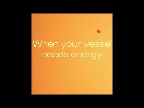
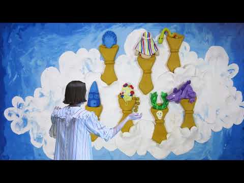
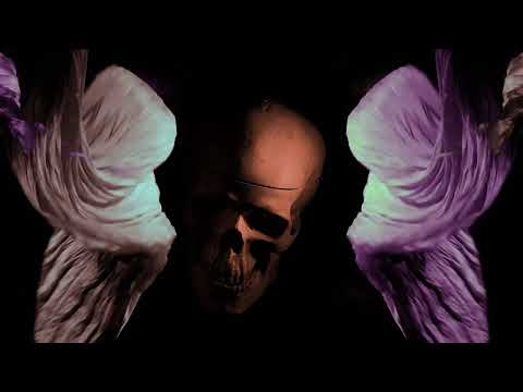 Clarence Neil ManatadMedia Arts
 -
 Adriana BergenDrawing
 -
 Casey DashneyVCD – Character Design & Illustration
 -
 Amy DangVCD – Character Design & Illustration
 -
 Sy McNarryVCD – Character Design & Illustration
 -
 Annamaria PereiraDrawing
 -
 Jiaqi ShiPhotography
 -
 Terri Lemire-WilsonVCD – Character Design & Illustration
 -
 Louise McFadyenFibre
 -
 Nicole Anne SantangeloMedia Arts
 -
 John ArnesonVCD – Character Design & Illustration
 -
 ya wenPhotography
 -
 Yayi WangVCD – Advertising & Graphic Design
 -
 Clarice HopfeVCD – Character Design & Illustration
 -
 Jessica TonnDrawing
 -
 Lian FajardoVCD – Character Design & Illustration
 -
 Suiwu YuDrawing
 -
 Holly HansenPainting
 -
 Madeline NevelosVCD – Character Design & Illustration
 -
 Sam SaloffVCD – Character Design & Illustration
 -
 Danielle EdwardsPhotography
 -
 Ever Jireh VenturaDrawing
 -
![AUArts Grad Show [1]_[The Wanderer]_[Timothy Kozlik]](https://auartsgrad.ca/app/uploads/2023/05/1_The-Wanderer_Timothy-Kozlik-32x21.jpg) Timothy KozlikPhotography
Timothy KozlikPhotography -
 Yixin LiCeramics
 -
 Rory SkuceVCD – Character Design & Illustration
 -
 Cianna JohnsonVCD – Advertising & Graphic Design
 -
 Emily ToshPhotography
 -
 Raya AtkinsVCD – Character Design & Illustration
 -
 Katherine DenneyVCD – Character Design & Illustration
 -
 Jinkai ZhangVCD – Character Design & Illustration
 -
 Alec FordhamVCD – Character Design & Illustration
 -
 Amber MayertPainting
 -
 Dominque L. LieversPhotography
 -
 William ArmstrongPainting
 -
 Jean GoleVCD – Character Design & Illustration
 -
 Elise FindlayDrawing
 -
 Lee Songyang LiPhotography
 -
 Garrett PoonVCD – Advertising & Graphic Design
 -
 Bianca McDonaldSculpture
 -
 Joshua OnPrint Media
 -
 Keila ReadmanVCD – Character Design & Illustration
 -
 Leia GuoPhotography
 -
 Kitt StoneVCD – Character Design & Illustration
 -
 Mckayla MacDonald-DixonVCD – Character Design & Illustration
 -
 Diane MarshallFibre
 -
 MARIA JOSE GOMEZ DE LA TORRE URBINAVCD – Character Design & Illustration
 -
 TheaFibre
 -
 Erica GuanVCD – Advertising & Graphic Design
 -
 Lavounie DoanMedia Arts
 -
 Emily FyfeVCD – Character Design & Illustration
 -
 Luz ArellanoFibre
 -
 Liam SkidmoreVCD – Character Design & Illustration
 -
 Portia ScabarGlass
 -
 Olivia BarthelemyVCD – Advertising & Graphic Design
 -
 Phillip Murray BanduraMFA in Craft Media
 -
 Jennifer KinniburghPainting
 -
 Erin GartnerDrawing
 -
 Emmett GervaisVCD – Character Design & Illustration
 -
 Marsel ReddickSculpture
 -
 Lloyd TempletonVCD – Character Design & Illustration
 -
 Sydney PaquettePainting
 -
 Cici LaiMFA in Craft Media
 -
 Myrrha TekyaVCD – Advertising & Graphic Design
 -
 Lizanne du PreezPainting
 -
 sherine lovelinVCD – Advertising & Graphic Design
 -
 Ian Jay GingcoVCD – Character Design & Illustration
 -
 Lisa BlackwellCeramics
 -
 Blake CochlanVCD – Advertising & Graphic Design
 -
 Laura HolckCeramics
 -
 Sheen BacudVCD – Character Design & Illustration
 -
 Paula HagerPhotography
 -
 Lucas AndersenFibre
 -
 Nadia PernaVCD – Advertising & Graphic Design